Author: Devika R
October 23, 2026
8 min read
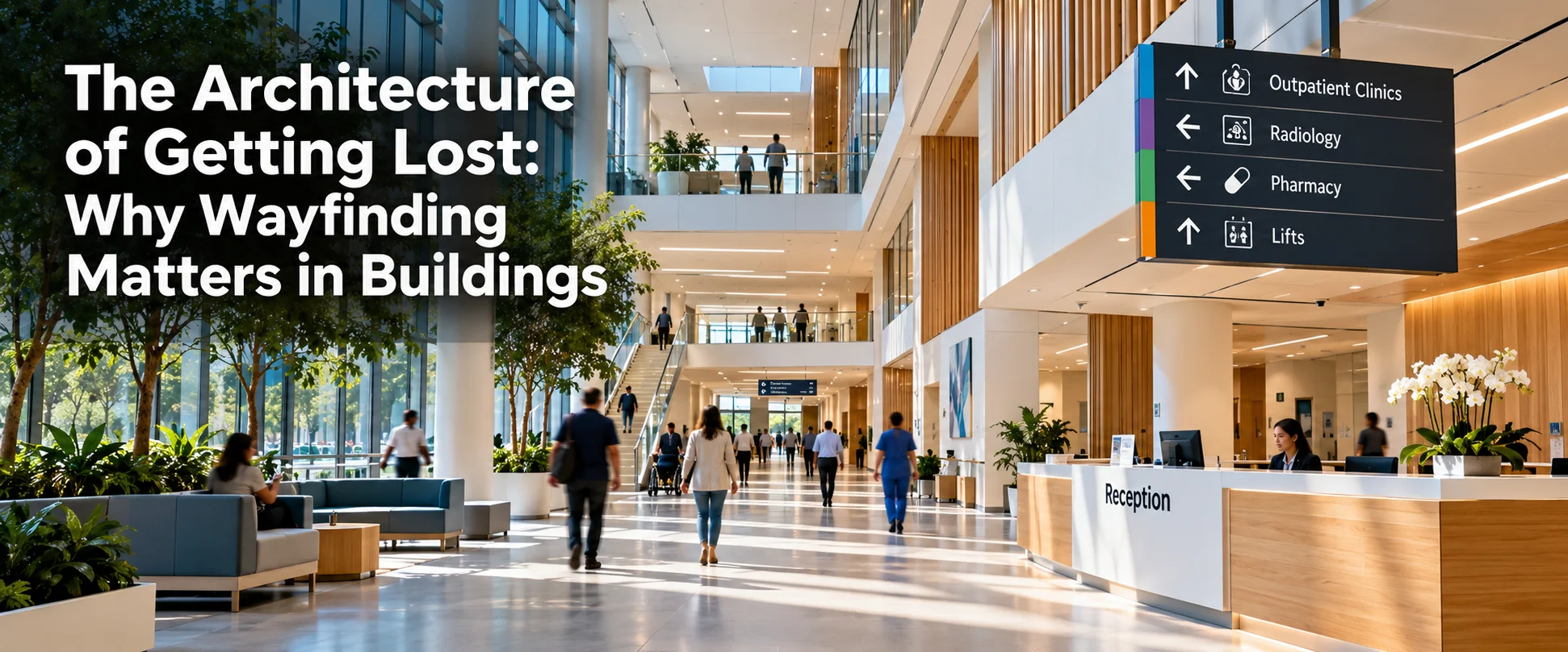
How spatial planning, visual cues and thoughtful architectural design help people find their way through unfamiliar buildings.
Imagine arriving at a hospital for an appointment. You enter through the main entrance, look for the reception desk and find yourself facing three corridors. You follow a sign, turn a corner and reach another junction. The department you need is somewhere nearby, but you are still not sure which way to go.
The building may be modern, well-lit and beautifully designed. Yet finding your destination feels harder than it should.
This is a problem of wayfinding—the process of understanding where you are, deciding where to go and navigating your way to a destination.
In architecture, wayfinding is often associated with signs, arrows and room numbers. But its influence begins much earlier, with the way a building is planned and how people experience its spaces.
A building should not merely accommodate people. It should help them understand where they are going.
Why Some Buildings Are Difficult to Navigate
Think about the last time you visited a large hospital, airport, shopping mall or university campus. You may have noticed that some spaces feel easy to understand, while others require constant checking of signs or asking for directions.
The difference is not always the size of the building.
Long corridors with identical doors, confusing junctions, hidden entrances and poorly differentiated floors can make orientation difficult. If every section looks similar, visitors may struggle to remember where they turned or which direction they need to take.
This becomes particularly challenging when people are unfamiliar with the layout, are under time pressure or are already dealing with stress.
A person visiting a hospital may be worried about an appointment. A passenger at an airport may be watching the time. A first-time visitor to a college campus may not know which building houses a particular department.
In these situations, clear wayfinding helps reduce uncertainty and makes navigating the building less stressful.
Wayfinding Begins Before the First Sign
One of the biggest misconceptions about wayfinding design is that confusing spaces can always be fixed by adding more signs.
Signage matters, but it cannot compensate for every problem in a building’s layout.
Consider a corridor that branches into several similar-looking routes. Adding more arrows may help, but the underlying arrangement may still be difficult to understand.
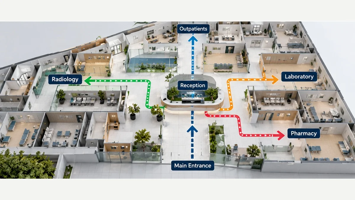
Architectural planning can make navigation easier by creating clear routes, recognisable entrances, visible destinations and logical connections between spaces.
For example, placing reception near the main entrance gives visitors an obvious first point of contact. Making the main circulation route easy to recognise helps people understand how to move through the building. Distinguishable zones can help visitors remember where they have been.
Visibility also plays an important role. When people can see a reception desk, staircase, atrium or another recognisable feature from a key location, they gain useful information about their surroundings.
Good wayfinding begins with a building that makes sense before anyone reads a sign.
The Power of Landmarks, Colour and Spatial Identity
People do not navigate buildings by memorising every corridor and doorway. They often rely on recognisable features to build an understanding of their surroundings.
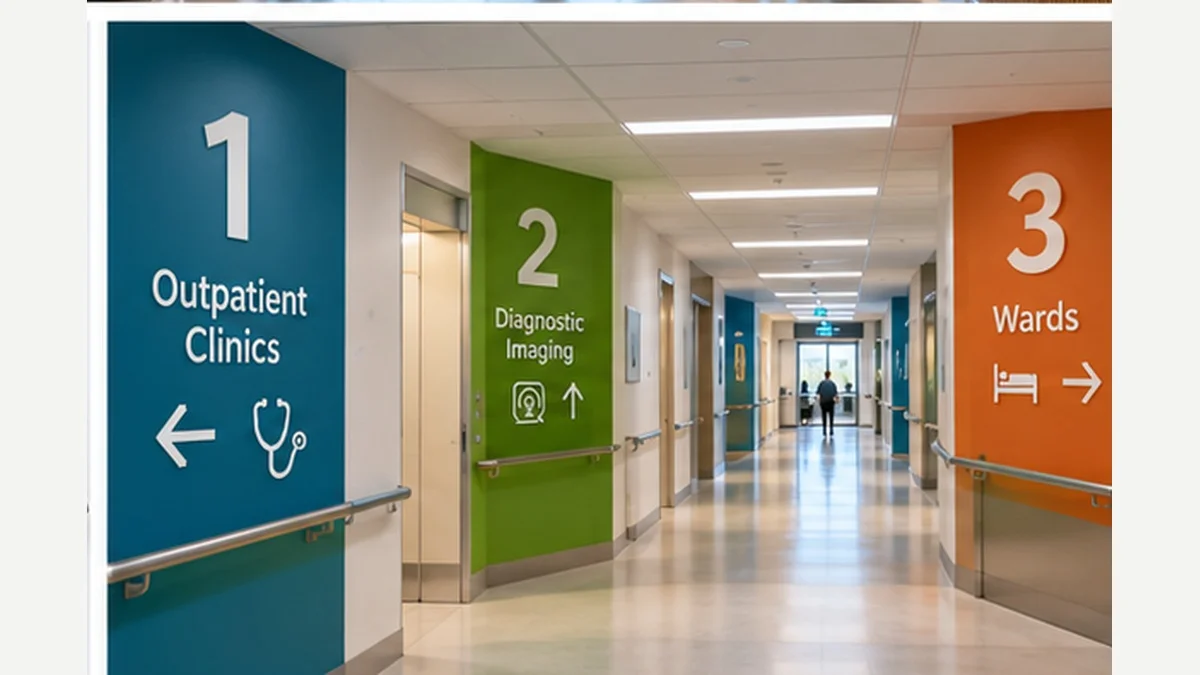
A central atrium, distinctive staircase, courtyard or clearly marked reception area can act as a landmark. These features provide reference points that help visitors orient themselves.
Colour can also support navigation when used consistently. Different floors, wings or departments might have distinct colour identities reflected in signs, maps and other visual cues.
However, colour should not be the only way information is communicated. Clear text, recognisable symbols, sufficient contrast and accessible alternatives remain important.
The goal is not to decorate every space differently. It is to create a visual and spatial system that helps people recognise where they are and which route to follow.
When landmarks and routes follow a consistent logic, visitors can navigate with greater confidence and less dependence on repeated directions.
Why Hospitals and Airports Need a Different Approach
Effective wayfinding in buildings depends on their purpose and the people who use them.
- Hospitals: Visitors may be anxious, unfamiliar with the facility or searching for an urgent service. Clear department names, recognisable routes and accessible information can reduce confusion. The entire journey, from the entrance to the destination, needs to make sense.
- Airports: Passengers must navigate check-in, security, departure gates, baggage collection and other facilities. Directional information needs to be clear at the points where people make decisions, not just near the entrance.
- Educational campuses: Students and visitors may need to move between separate buildings, blocks, laboratories and administrative departments. Building names, maps and consistent identification systems help connect the wider campus.
- Offices and commercial buildings: Visitors may need to locate a company, meeting room or service without knowing the internal layout. Clear arrival points and a logical route from reception to the destination can make the experience smoother.
Each setting presents different challenges. A successful wayfinding system considers the activities, expectations and needs of its users rather than applying the same signage approach everywhere.
Accessibility Must Be Part of the Design
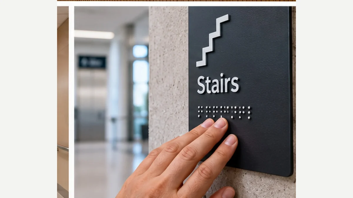
A building that is easy to navigate for one person may be difficult for another.
People with visual impairments, hearing impairments, mobility limitations or cognitive difficulties may encounter barriers that other visitors do not notice. Language differences and unfamiliar symbols can create additional challenges.
Inclusive wayfinding uses several complementary forms of information.
High-contrast text and clear symbols can improve the readability of signs. Tactile lettering and Braille provide important information in locations where such features are appropriate or required. Consistent landmarks, surface cues and accessible circulation routes can further support orientation.
For example, directing a wheelchair user towards a staircase without clearly identifying an alternative lift route creates an avoidable barrier. Similarly, a person with low vision should not have to rely entirely on colour-coded directions to identify a department.
The placement of information matters too. A sign hidden behind a door, blocked by furniture or positioned where visitors cannot easily see it offers little practical help.
Accessibility should therefore be considered during architectural planning, with attention to applicable accessibility standards and the needs of different users.
The aim is to make navigation understandable and usable for as many people as possible, including those visiting the building for the first time.
Can Digital Navigation Solve the Problem?
Indoor navigation applications, interactive directories, digital maps and QR-code-based directions can help visitors find their way through complex buildings.
A visitor might receive directions to a particular department, locate a meeting room or identify the route to an airport gate. In large facilities, digital systems can offer detailed information that would be difficult to communicate through signs alone.
But digital tools have limitations.
Visitors may not have internet access, may be unfamiliar with the application or may prefer not to use their phones while moving through an unfamiliar environment.
Digital navigation also depends on accurate and regularly updated information. If a corridor is temporarily closed, a department relocates or an accessible route becomes unavailable, outdated directions can create further confusion.
For these reasons, technology works best when it supports a clear physical environment rather than trying to compensate for a confusing one.
The strongest approach combines good architectural planning with reliable physical and digital information.
How Architects Can Design for Better Wayfinding
Wayfinding is easier to incorporate when it is considered early in the design process. A few practical questions can help guide decisions.
1. Where will people enter?
Identify the main arrival points and make it clear what visitors should do when they enter. Reception areas, information desks and primary circulation routes should be easy to recognise.
2. Where will people need to make decisions?
Pay particular attention to junctions, corridor intersections, lifts, staircases and transitions between building zones. These are locations where people often need clear directional information.
3. Can visitors recognise where they are?
Use appropriate landmarks, consistent floor identities and visible connections between spaces. Avoid making every corridor or zone appear identical when clear differentiation would help.
4. Can different people use the system?
Consider readable text, contrast, tactile information, accessible routes and the needs of visitors who may not speak the local language.
5. Has the design been tested with real users?
Consider a hospital where the outpatient department is located beyond several corridor junctions. The architectural plan may appear straightforward to the design team, but a first-time visitor may struggle to identify the correct route.
Testing the journey from the main entrance to the department can reveal where directional information, clearer landmarks or changes to the circulation layout are needed.
Design teams may know a building’s layout extremely well because they have studied it for months. First-time visitors do not share that knowledge.
Walking through proposed routes, conducting user testing or reviewing wayfinding at key decision points can reveal problems that drawings alone may not make obvious.
Wayfinding should be evaluated from the visitor’s perspective, not only from the designer’s understanding of the plan.
A Better Building Starts With the Visitor
Architecture is often judged through photographs, materials, proportions and visual impact. Yet the everyday experience of a building also depends on how easily people can understand and use it.
A visitor should not need to study a floor plan every time they reach a junction. A student should not struggle to find a classroom on the first day. A patient should not have to ask several people for directions to an appointment.
These experiences may seem small compared with a building’s structure or appearance, but they influence how people feel about the place and how effectively it serves them.
Wayfinding reminds us that architecture is not experienced from a drawing or rendering. It is experienced through movement, observation and decisions made while moving through real spaces.
The best wayfinding system is not necessarily the one with the most signs. It is the one that helps people reach the right place with confidence.
Professional BIM Course
Master BIM Course
Structural Design Concepts and BIM
Certified MEPF BIM Master Course
Electrical BIM Professional Program
RenderLab – Master 3D Modeling & Photorealistic Rendering
Multi-Tool Mastery for Architects & Engineers
BIM Coordinator Workflow Program
BIM FastTrack – 30 Day Intensive Training
Global Architectural & Structural BIM Project Program